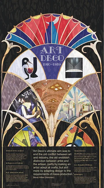
svg

Blog articles

The Arts and Crafts Movement

When we talk about the history of graphic design, one of the earliest and most influential movements to shape the discipline is the **Arts and Crafts Movement**. Emerging in Britain in the late 19th century, this movement was more than just a design style—it was a philosophy that reshaped the way artists, craftsmen, and eventually designers thought about their work. ## Origins of the Movement The Arts and Crafts Movement was born as a reaction to the Industrial Revolution. Factories had begun mass-producing goods, leading to a decline in craftsmanship and aesthetic quality. Figures like **William Morris**, often considered the father of the movement, believed in reviving the beauty of handcrafted work, where form and function went hand in hand. ## Characteristics in Design In graphic design, the Arts and Crafts Movement emphasized: - **Handcrafted Typography:** Lettering was often decorative, inspired by calligraphy, yet highly functional. - **Ornamental Patterns:** Repeated floral motifs, nature-inspired elements, and intricate borders were common. - **Balanced Layouts:** Designs were harmonious, blending type and imagery seamlessly. - **Rich Materials:** The philosophy valued quality over quantity, influencing choices in printing, paper, and bookbinding. Morris and his **Kelmscott Press** became synonymous with this style, producing books that were not only functional but works of art in themselves. ## Influence on Graphic Design The Arts and Crafts Movement laid the groundwork for many graphic design principles we still value today: - Respect for typography as a design element. - A belief that good design should be accessible, functional, and aesthetically pleasing. - A foundation that influenced later movements like **Art Nouveau** and the **Bauhaus**. ## Why It Still Matters Even in our digital-first era, the Arts and Crafts philosophy resonates. The rise of hand-lettering, custom typography, and artisanal design in branding and packaging today echoes the same values: **authenticity, craftsmanship, and attention to detail**. <br /> The Arts and Crafts Movement reminds us that design isn’t just about visuals—it’s about intention, care, and creating work that connects deeply with people. --- <br /> ✦ _The Arts and Crafts Movement wasn’t just about reviving craft; it was about redefining design as a human-centered, meaningful practice. And that spirit continues to inspire graphic designers even today_.

Art Nouveau

Following the handcrafted ideals of the **Arts and Crafts Movement**, the late 19th and early 20th centuries saw the rise of **Art Nouveau**—a design movement that celebrated beauty, ornamentation, and the seamless integration of art into everyday life. ## Origins of the Movement **Art Nouveau**, meaning _“new art”_ in French, emerged across Europe around the **1890s**. It was a reaction to both the rigidity of academic art and the starkness of industrial production. Rather than rejecting modernity, it sought to make it beautiful, weaving artistic elegance into **architecture, interiors, and graphic design**. In graphic design, the movement was led by iconic figures like **Alphonse Mucha**, whose theatrical and product posters became synonymous with Art Nouveau’s graceful visual language. ## Characteristics in Design Art Nouveau in graphic design is instantly recognizable for its: - **Flowing Organic Forms:** Curving lines inspired by vines, flowers, and natural elements. - **Decorative Typography:** Letterforms that were elaborate yet integrated seamlessly with imagery. - **Ornamental Borders & Frames:** Intricate details that framed posters and prints. - **Female Figures & Symbolism:** Women—often portrayed with long flowing hair—became central motifs. - **Nature-Inspired Palettes:** Soft, earthy tones balanced with bold highlights. These elements transformed **posters, advertisements, and book covers** into timeless works of art. ## Influence on Graphic Design Art Nouveau elevated graphic design in everyday culture by: - Turning posters into **collectible artworks** rather than mere advertisements. - Encouraging typography to **merge with illustration**, enhancing visual storytelling. - Influencing **branding and advertising**, where image and text worked as one. - Acting as a bridge between traditional ornamentation and **modernist simplicity**, paving the way for **Art Deco** and the **Bauhaus**. ## Why It Still Matters The influence of Art Nouveau continues to resonate in **branding, packaging, and editorial design**, where elegance and ornamentation are prized. Contemporary designers revive its motifs—delicate lines, decorative borders, and nature-inspired patterns—to add sophistication and a timeless quality to their work. <br /> ✦ **Art Nouveau** reminds us that design can be both **functional and poetic**, merging nature, ornament, and typography into a seamless whole that continues to inspire over a century later.

Art Deco

As the world moved into the **1920s**, design shifted dramatically from the flowing curves of **Art Nouveau** to something sharper, bolder, and more modern. This was the age of **Art Deco**—a movement that embodied **luxury, progress, and the spirit of the Jazz Age**. ## Origins of the Movement **Art Deco** emerged in **France** just before **World War I** but gained worldwide prominence in the **1920s and 1930s**. It coincided with an era of **rapid industrialization, skyscrapers, and glamorous lifestyles**. Where Art Nouveau celebrated organic beauty, Art Deco embraced the **machine age**—favoring **order, symmetry, and geometric precision**. In graphic design, Art Deco became a defining style of the **interwar period**, influencing everything from **travel posters to product packaging**. ## Characteristics in Design Art Deco graphic design can be identified by: - **Geometric Shapes & Symmetry:** Strong lines, sharp angles, and bold geometric patterns. - **Luxurious Color Palettes:** Gold, silver, deep blacks, emerald greens, and royal blues. - **Stylized Typography:** Sans-serif and decorative typefaces with elongated forms. - **Streamlined Imagery:** Simplified, bold illustrations with a sense of glamour and speed. - **Influence of Modernity:** Motifs drawn from skyscrapers, automobiles, and aviation. These qualities made **Art Deco** perfect for advertising a **new era of technology, fashion, and entertainment**. ## Influence on Graphic Design Art Deco set the stage for modern branding and advertising by: - Establishing **visual sophistication**—a look associated with elegance and exclusivity. - Inspiring **poster design** for travel, films, and luxury goods. - Introducing a balance between **ornamentation and functionality**, keeping designs bold but not overly decorative. Designers like **A.M. Cassandre** became icons of the era, with posters such as _Normandie (1935)_ still studied as examples of timeless Art Deco design. ## Why It Still Matters Today, **Art Deco’s influence** is experiencing a revival in **branding, packaging, and luxury identity design**. Its **geometric clarity** and **refined glamour** make it a go-to reference for projects aiming to feel both **vintage and timelessly elegant**. <br /> ✦ **Art Deco** was more than a style—it was the **visual language of modernity in the 1920s**, blending **geometry, luxury, and progress** into one of the most iconic design movements in history.

Constructivism

While **Art Deco** captured the glamour of the 1920s, another movement was taking root in **Russia** with a very different mission. **Constructivism** wasn’t about luxury or ornament—it was about **communication, politics, and the power of design to serve society**. ## Origins of the Movement **Constructivism** emerged in **Russia** around **1915** during a period of **political revolution and social upheaval**. Artists like **Alexander Rodchenko** and **El Lissitzky** rejected traditional fine art, arguing that design should be **functional, collective, and serve practical purposes** like **education and propaganda**. Unlike decorative movements before it, Constructivism saw design as a **tool for building a new society**. ## Characteristics in Design Constructivist graphic design is instantly recognizable for its bold and radical style: - **Geometric Abstraction:** Circles, triangles, and rectangles arranged with mathematical precision. - **Dynamic Composition:** Strong diagonals, asymmetry, and a sense of movement. - **Limited Color Palette:** Striking use of red, black, and white for maximum contrast. - **Photomontage:** Combining photography with typography to create powerful visual messages. - **Bold Typography:** Sans-serif lettering, often blocky and integrated into the design itself. These elements gave Constructivist posters their **iconic look—eye-catching, urgent, and politically charged**. ## Influence on Graphic Design Constructivism’s impact on graphic design has been profound: - It pioneered **modern poster design**, turning visuals into a powerful communication tool. - It introduced **photomontage and collage techniques** that influenced later advertising and editorial design. - Its commitment to **clarity and function** foreshadowed the modernist ideals of the **Bauhaus** and **Swiss Style**. ## Why It Still Matters Today, **Constructivist aesthetics** resurface in **editorial layouts, political campaigns, and contemporary poster design**. Its **striking geometry** and **high-contrast style** continue to inspire designers looking for **bold, impactful visual storytelling**. <br /> ✦ **Constructivism** was more than an art movement—it was a **design revolution** that turned posters and typography into **tools for shaping society**.

De Stijl

Amid the turbulence of the early 20th century, a group of **Dutch artists and designers** introduced a radically new vision of design—one built on **simplicity, abstraction, and order**. This was **De Stijl**, a movement that sought to **strip away the unnecessary** and arrive at a **universal visual language**. ## Origins of the Movement Founded in **1917** by painter **Theo van Doesburg** along with figures like **Piet Mondrian** and **Gerrit Rietveld**, **De Stijl** (meaning _“The Style”_ in Dutch) was more than an art movement—it was a **philosophy**. The goal was to achieve **harmony and order** in design by reducing everything to its **purest essentials**. ## Characteristics in Design De Stijl’s influence on graphic design can be seen in its: - **Primary Colors:** Red, blue, and yellow, balanced with black, white, and gray. - **Geometric Forms:** Strict use of rectangles, squares, and straight lines. - **Grid-Based Layouts:** Early examples of structure and modularity in design. - **Minimal Typography:** Clean, sans-serif typefaces used sparingly. - **Balance and Harmony:** Asymmetry used deliberately to create equilibrium. These principles translated beautifully into **posters, books**, and later into **architecture and furniture**, making **De Stijl** a **holistic design system**. ## Influence on Graphic Design De Stijl profoundly shaped modern graphic design by: - Introducing the **grid system**, which became central to **Swiss Style** and **contemporary layout design**. - Demonstrating that **simplicity and abstraction** could be powerful tools for communication. - Providing a **visual vocabulary** that influenced the **Bauhaus** and countless **modernist designers**. ## Why It Still Matters The **clarity and reductionism** of **De Stijl** still resonate in today’s **digital and editorial design**. Whether it’s **clean app interfaces** or **minimalist branding**, the emphasis on **grids, geometry, and balance** can be traced back to this movement. <br /> ✦ **De Stijl** proved that design doesn’t need to be complex to be meaningful—sometimes, the **purest forms and simplest colors** are the most universal.

Bauhaus

If there is one movement that shaped the foundation of **modern graphic design**, it is without doubt the **Bauhaus**. More than a style, Bauhaus was a **philosophy** that united **art, craft, and technology** into a new approach that continues to influence design today. ## Origins of the Movement Founded in **1919** in **Weimar, Germany**, by architect **Walter Gropius**, the **Bauhaus School** aimed to **bridge the gap between art and industry**. At its core was the belief that **design should be functional, accessible, and reflective of the modern age**. Teachers such as **Paul Klee**, **Wassily Kandinsky**, **László Moholy-Nagy**, and later **Herbert Bayer** played a pivotal role in shaping its **multidisciplinary vision**. ## Characteristics in Design In graphic design, Bauhaus can be identified by: - **Geometric Simplicity:** Use of circles, squares, and triangles as building blocks. - **Sans-Serif Typography:** Clean, modern typefaces like Bayer’s _“Universal”_ font. - **Grid Systems:** Structured layouts that emphasized clarity and order. - **Functional Color Use:** Red, blue, yellow, and black, used for contrast and hierarchy. - **Integration of Type and Image:** Typography treated as a visual element, not just text. This stripped-down, **rational approach** revolutionized **posters, books, and advertising design**. ## Influence on Graphic Design The **Bauhaus movement** left an enduring mark by: - Establishing the **grid system**, which underpins much of today’s **editorial and digital design**. - Inspiring **modernist typography**, focusing on **legibility and functionality**. - Promoting the idea that **form follows function**, still a guiding principle in design disciplines. - Paving the way for later styles such as the **Swiss / International Typographic Style**. ## Why It Still Matters **Bauhaus design principles** continue to thrive in **contemporary branding, editorial, and digital products**. From **minimalist logos** to **structured web layouts**, its DNA is embedded in **how designers think and work**. --- <br/> ✦ _The **Bauhaus** didn’t just influence design—it **redefined it**, laying the groundwork for a **global visual language** that continues to shape how we communicate today_.

Swiss Style

By the mid-20th century, graphic design entered a new era of **clarity, order, and universality**. Known as the **Swiss Style** or **International Typographic Style**, this movement became one of the most influential design approaches of the modern age—and it still defines much of today’s branding, publishing, and digital design. --- ## Origins of the Movement The Swiss Style emerged in **Switzerland and Germany** during the **1940s and 1950s**, developed by designers such as: - **Josef Müller-Brockmann** - **Max Bill** - **Armin Hofmann** In a post-war world seeking **clarity and communication**, designers moved away from **decorative excess** and embraced **rational, functional design**. --- ## Characteristics in Design Swiss Style is immediately recognizable for its: - **Grid Systems:** The foundation of all layouts, ensuring balance and consistency. - **Sans-Serif Typography:** Typefaces like _Helvetica_ and _Univers_ defined the era. - **Asymmetrical Layouts:** A break from rigid symmetry, giving a dynamic yet ordered look. - **Photography over Illustration:** Clean, realistic imagery replaced ornate graphics. - **Minimal Use of Color:** Often limited palettes, used sparingly for hierarchy. This approach turned graphic design into a **global language—clean, objective, and timeless**. --- ## Influence on Graphic Design The impact of Swiss Style is profound: - Standardized **typographic hierarchy**, shaping text structure in print and digital media. - Popularized **Helvetica**, one of the most widely used typefaces in history. - Inspired **corporate branding systems**, influencing companies from _Lufthansa_ to _IBM_. - Laid the foundation for **modern UI and web design**, where grids and minimalism still reign. --- ## Why It Still Matters From corporate identities to sleek app interfaces, **Swiss Style remains the backbone of modern design**. Its emphasis on **function, clarity, and universality** continues to guide how designers communicate visually in an increasingly globalized world. --- <br/> ✦ _Swiss Style wasn’t just a design trend—it was the establishment of a visual language built on clarity, neutrality, and timeless precision._